The hidden rules of color matching that designers rarely reveal!
Hidden rule 1. Colorless space highlights the color-jumping effect
The so-called "colorless" is of course not really without color, which is what most people think of as black, gray and white. In this grayscale space that is considered colorless, clearly selecting an object or block for a jump color design will definitely be quite obvious and stand out, just like a single color on white paper. Single color is not limited to primary color, you can also choose mixed colors. Primary colors show pure personality, while mixed colors have a soft and tender feeling when mixed with white, and a low-key and restrained feeling when mixed with gray
Hidden rule 2. The same color is the safest and creates a stable atmosphere
When it comes to color matching principles that don't go overboard, the first thing to recommend is matching with the same color. The use of the same color can create a calm and stable atmosphere. For example, the gray wooden door and wall are matched with the gray fabric sofa and black floor lamp. The same color will make the space look more elegant and rhythmic. Whether it is the color change of gray, light gray blue and blue, or the dance of indigo, gray blue and white, it can easily create a harmonious and peaceful home feeling
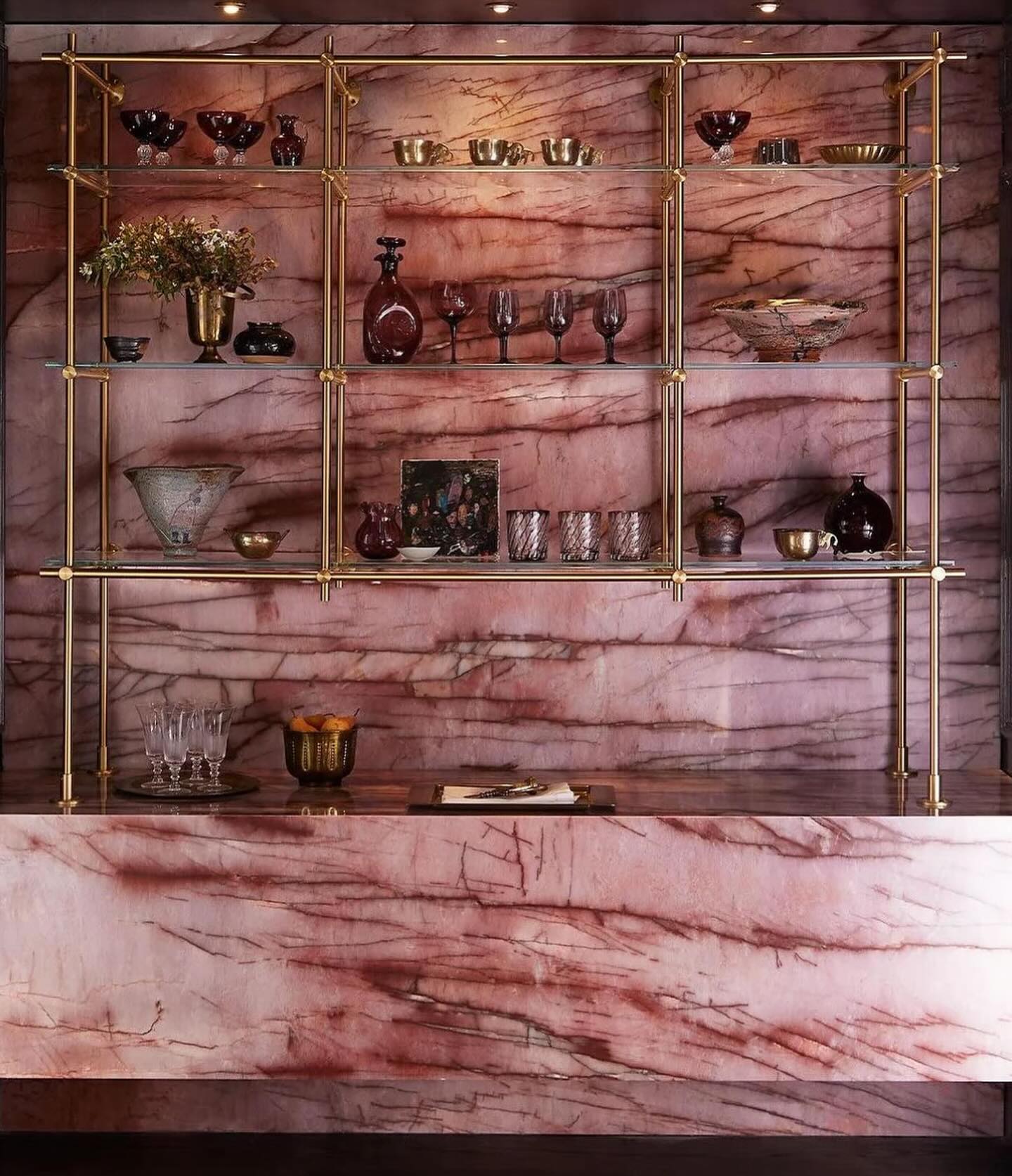
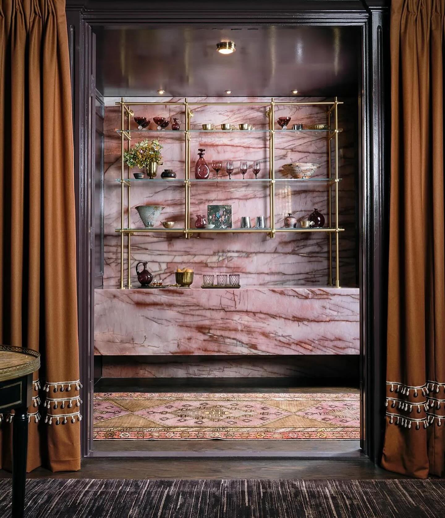
Hidden rule 3. Not limited to girls! How to decorate a pink space
Whether you are 3 to 80 years old, the girlish heart knows no age limit. However, not many people dare to put a lot of pink in their homes. In fact, as long as you grasp the key points, pink is not limited to girls, but can bring a moderate stress relief effect to the home. Through the co-construction of pink walls and light-colored wood, pink has a bit more stability and warmth, and the space immediately presents a warm feeling. In the other two cases, pink with grayscale is used to convey another mature sense of space. This is called Morandi pink, which is also a recent
Hidden rule 4. Earth tones inject a warm, natural feel into life
Earth tones generally refer to the selection of warm and solid colors close to nature as the main tone of the space. Generally, space designers often use earth tones such as camel, khaki, khaki, brown, dark green, etc. Because this color is neither too hot nor too cold, it can make the entire space look more comfortable and elegant, and has the effect of stabilizing emotions. In addition, earth tones are often accompanied by the use of partial white and black to adjust the brightness, presenting a favorite home atmosphere